
Best IT Support Satisfaction Tools 2026: The Full Comparison
An IT-specific comparison of the six best support satisfaction tools in 2026: HappySignals, ciopulse, Simplesat, Nicereply, and more.

On 30 June 2026, Delighted went dark. The NPS survey tool that many IT teams quietly relied on for years was retired by its parent company Qualtrics as part of a consolidation into its enterprise XM Suite. Contracts stopped renewing months before that; the sunset itself gave customers a fixed migration deadline and no extensions. If you were a Delighted user, you were forced to make a decision this year. If you're an IT leader who's been evaluating alternatives regardless, the market you're looking at right now is fundamentally different from the one that existed 12 months ago.
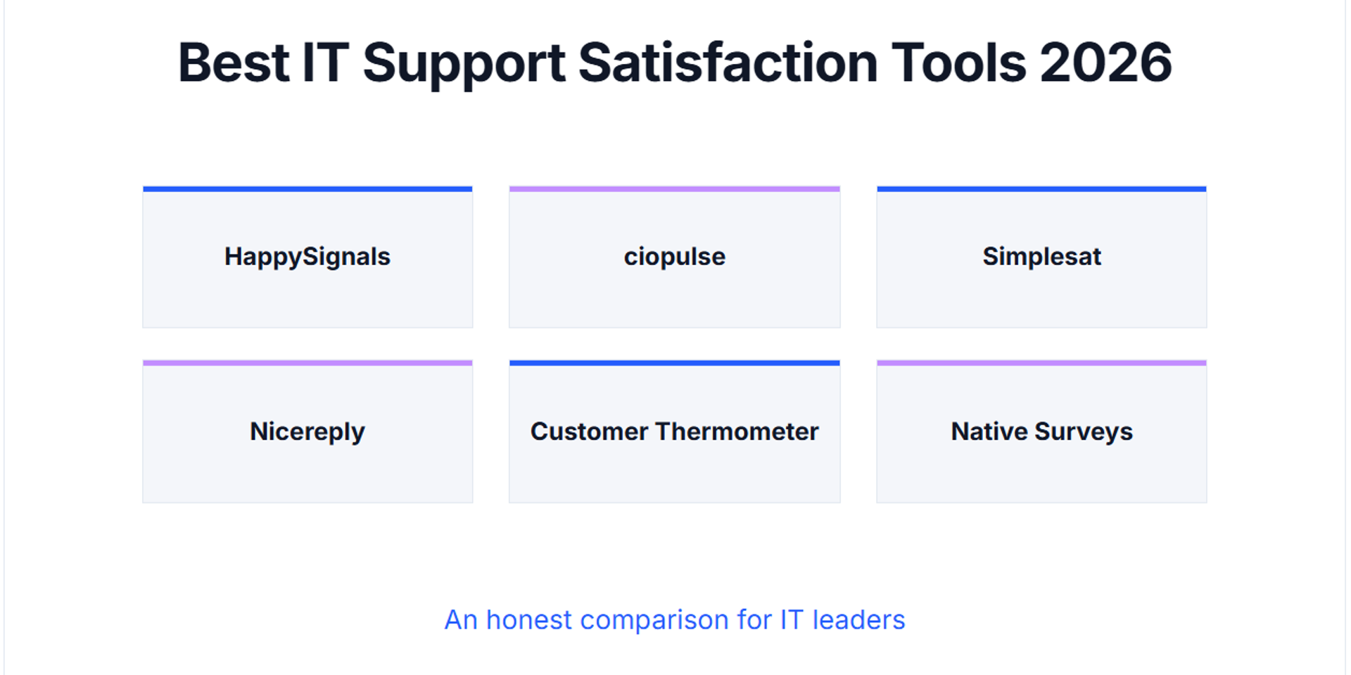
That's the awkward reality of choosing an IT support satisfaction tool in 2026. The category has grown fast, consolidated in ways that don't always favour the buyer, and the top of most "best CSAT tools" search results is dominated by vendors ranking themselves at number one. This article is different: it's an IT-specific comparison that ranks tools by who each one is genuinely best for, not by who paid to be top of the list.
The short answer, up front and honest:
- HappySignals is best for large enterprises building a formal XLA programme with budget to match.
- ciopulse is best for ANZ and other organisations that need local data residency, NPS-first measurement, and MSP accountability.
- Simplesat is best for MSPs and mid-market service teams already on ConnectWise, Autotask, or Zendesk.
- Nicereply is best for support teams operating primarily out of Zendesk or Help Scout email workflows.
- Customer Thermometer is best for teams wanting a fast, lightweight ServiceNow-integrated deployment.
- ServiceNow, Jira Service Management, or Zendesk native surveys are best when your ticket volume is low, your support is single-team, and "how satisfied were you?" is the only question you need to answer.
The rest of this guide explains how we arrived at those recommendations, gives you a six-question decision framework to run your own comparison, and then works through each tool with a practical mini-profile. If you're just here for the summary, the bullets above are the article in twelve seconds. If you want to make a defensible tool decision your CFO and IT team will both stand behind, read on.
Do You Even Need a Third-Party Satisfaction Tool?
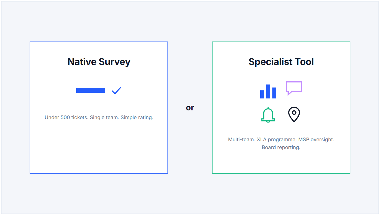
Before we compare six of them, it's worth asking whether you need a specialist tool at all. Every major ITSM platform, ServiceNow, Jira Service Management, Zendesk, Freshservice, has some form of built-in satisfaction survey. If your ticket volume is modest and your reporting needs are straightforward, the tool you already own may genuinely be enough. It's cheaper, it's already integrated, and it doesn't add another vendor to your stack.
Here's what those built-in surveys typically do well: they trigger a simple CSAT rating after a ticket is resolved, they store the score against the ticket in the activity feed, and they roll up into a standard reporting dashboard. For a single-team service desk running under 500 tickets a month with no MSP relationship to grade, that's a reasonable stopping point.
Here's what they don't do, and where a specialist tool starts to earn its price:
- Rich segmentation by agent, team, and service category. Native tools give you an average. A specialist tool lets you interrogate the score down to the individual agent, the specific team, or the request type. That granularity is what turns a satisfaction number into a coaching conversation.
- Automated service recovery on low scores. A detractor score in a native tool sits in the reporting dashboard until someone reviews it, often days later. A specialist tool routes it into a proper follow-up workflow so the team lead can act while the ticket memory is still fresh.
- AI-driven analysis of open-text comments. Manually reading hundreds of comments a week isn't realistic for any busy service desk. Specialist tools apply sentiment analysis and theme detection to surface recurring language patterns automatically.
- Benchmarking against comparable organisations. Some specialist tools carry aggregated data from their customer base, so you can compare your score against peer averages rather than judging in isolation.
- XLA-ready measurement architecture. If you're building an Experience Level Agreement programme, you need ticket-level attribution, journey-level reporting, and target-versus-actual comparisons. Native surveys aren't designed for any of that.
- Independent measurement in MSP contexts. If an outsourced provider is running your service desk, an MSP grading its own experience data on a platform it also operates is a structural conflict of interest.
The decision heuristic is straightforward. Stick with your native survey if you're under 500 tickets a month, single-team, no MSP oversight, and you're happy with "how satisfied were you?" as your only question. Add a specialist tool if any one of these applies: multi-team support, agent-level coaching needs, an XLA programme, MSP contract oversight, board-level executive reporting, or a data-residency requirement your ITSM can't meet.
If you're clearly in the second camp, the rest of this article compares your six main options.
How We Compared These Tools: A Six-Question Decision Framework
Most "best CSAT tools" articles skip to the ranked list before helping you understand what you're actually ranking against. That's why so many tool decisions land badly: the buyer ends up choosing the tool with the biggest brand rather than the tool that fits their environment. Before you compare, run your own answers through these six questions. They're the same criteria we used to build the ranking that follows.
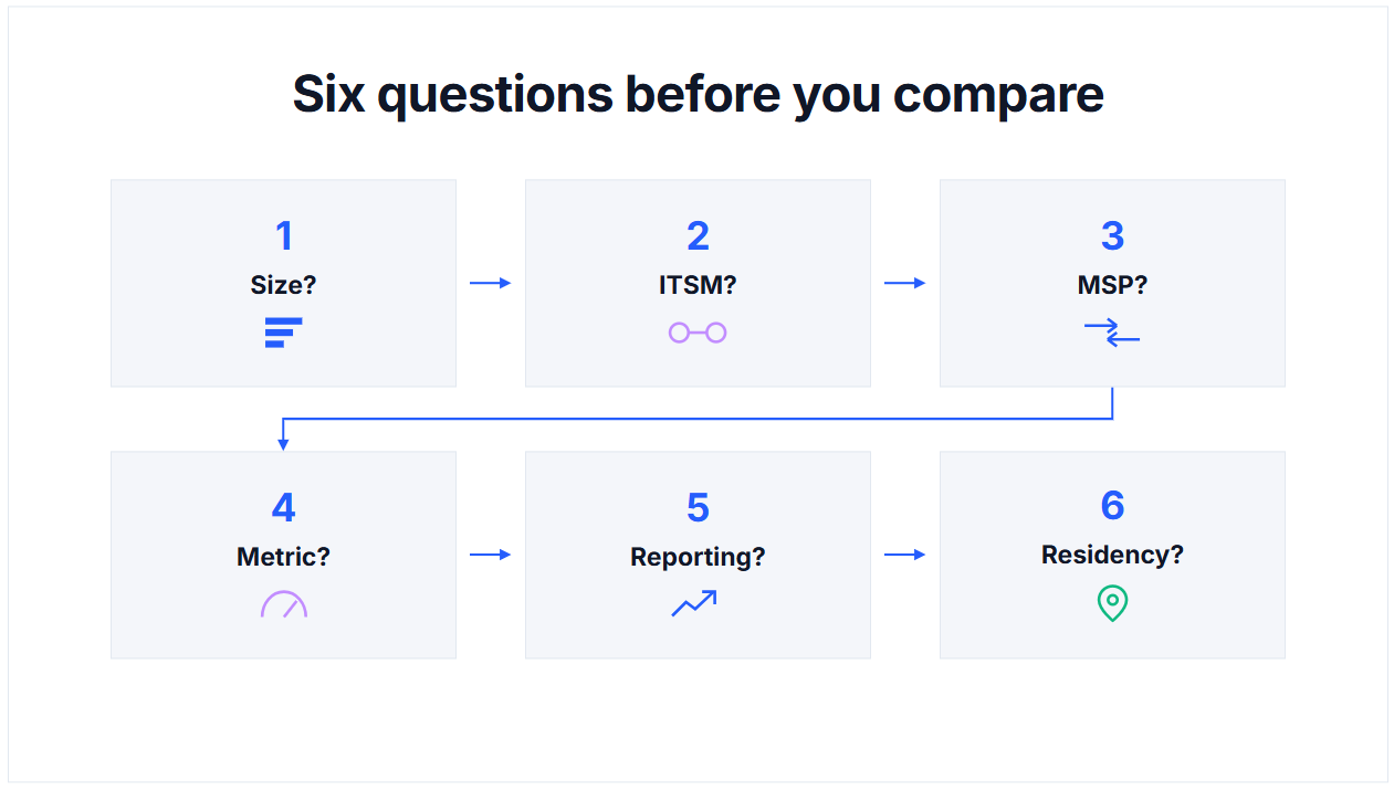
1. What's your organisation size and support scale?
Under 500 tickets a month with a single support team is a very different problem to 15,000 tickets a month across multiple business units, MSPs, and geographies. Some tools price and scale for small MSPs; others start at €30,000 a year and target enterprises with 1,000+ employees. The wrong-scale tool costs you either capability (too small) or budget (too large).
2. Which ITSM platform do you already run?
ServiceNow, Jira Service Management, Zendesk, Freshservice, BMC Helix, ManageEngine, Ivanti, or something else? Every specialist tool integrates well with some ITSMs and poorly with others. A tool that's built around ConnectWise won't serve a ServiceNow shop as smoothly. Match the integration depth to your actual stack.
3. Do you have an MSP relationship to measure?
If an outsourced provider runs your service desk, the measurement platform matters as much as the metric. An MSP grading its own experience data on its own platform is a structural conflict of interest, regardless of individual intent. Independent measurement, where the platform is operated separately from the party being measured, is what turns satisfaction data into contract-grade governance.
4. What's your primary metric preference: CSAT, NPS, CES, or a mix?
Some tools default to CSAT (a 1-to-5 rating). Some default to NPS (a stricter 0-to-10 scale where lukewarm 7s and 8s count for nothing). Some support all three. The choice matters more than most buyers realise, because the scoring model shapes how much signal you actually get out of a low score. If you haven't thought this through, we've unpacked it in a dedicated guide to choosing the right satisfaction metric
5. Do you need executive or board-level reporting?
CIOs presenting to boards need more than a raw satisfaction number. They need trend against target, productivity impact, journey-level breakdowns, and a way to translate service performance into business language. Some tools ship with proper executive reporting built in. Others assume you'll build the dashboards yourself in Power BI or Tableau.
6. Where must the data physically live?
For ANZ banks, hospitals, universities, and government agencies, employee feedback data often has a regulatory or contractual requirement to stay in-country. Most satisfaction tools publish general compliance frameworks (GDPR, ISO 27001, SOC 2) but don't disclose their specific hosting region. For regulated buyers, that ambiguity is a procurement problem, not a nice-to-have. Get a specific answer before you sign.
The six-tool comparison that follows scores each option against these questions. Weight them by what matters most in your environment. There isn't a universally best tool. There's a best-for-you tool.
The Best IT Support Satisfaction Tools in 2026
Six tools worth genuine consideration, in an order that reflects their category strength rather than a strict best-to-worst ranking. Each mini-profile is short by design: enough to help you decide whether to shortlist, not so much that you'll skim past what matters.
HappySignals
Best for: large enterprises building a formal Experience Level Agreement (XLA) programme, with 1,000+ employees and enterprise budget.
Key capabilities: the category-defining IT Experience Management platform. Combines experience data (satisfaction, sentiment) with operational data (ticket volume, MTTR, reassignments) to power benchmark reporting and XLA governance. Publishes aggregated benchmark data across its customer base spanning multiple continents.
Pricing: entry tier publicly listed at €30,900 per year on G2, climbing across three tiers. Not publicly transparent beyond the entry number; enterprise contracts are negotiated.
What it does well: the deepest benchmark data in the category, a clear enterprise XLA framing, and mature partnerships with global systems integrators. If you're building a formal experience-management practice with executive sponsorship, HappySignals has the longest track record.
What it does less well: priced out of mid-market and MSP conversations. English-only. Compliance frameworks (ISO 27001:2022, GDPR) are published, but the specific hosting region isn't publicly disclosed, which can be a procurement friction for regulated buyers.
ciopulse
Best for: ANZ organisations, regulated industries, and any team that needs local data residency, NPS-first measurement at the ticket level, or independent measurement in MSP contexts.
Key capabilities: ticket-level attribution to individual agents, teams, and service categories. NPS-first as the primary metric. Daily Service Recovery Alerts covering the previous day's detractor ratings, delivered by SMS and email to the support lead. PulseAI is an opt-in AI feature that summarises open-text feedback at the aggregate level, monthly per client, to surface recurring themes. Support-group comparison views (league tables) that make internal-versus-MSP performance visible in hybrid IT environments.
Pricing: enterprise-tier, quote-based. Not publicly listed.
What it does well: the only ANZ-resident option in this comparison, hosted in AWS ap-southeast-2 (Sydney). A ServiceNow Select Partner with a certified app on the ServiceNow Store, alongside integration with any ITSM that can include a survey URL in its closure notification. Independent measurement is built into the design, which matters for MSP-managed environments.
What it does less well: smaller public review footprint on G2 and Capterra than HappySignals or Simplesat. Limited benchmark data compared to HappySignals's decade of aggregated numbers.
Simplesat
Best for: MSPs and mid-market service teams already running ConnectWise, Autotask, Zendesk, or Freshdesk.
Key capabilities: one-click CSAT, CES, and NPS surveys embedded in email signatures or triggered at ticket closure. 50+ native integrations, with particularly deep support for MSP-oriented ITSM tools. Multi-language surveys and multi-brand accounts. Hosted on AWS, SOC 2 certified.
Pricing: publicly transparent. Standard plan from $79 per month (annual billing) or $119 per month (Capterra-verified). Scales with response volume and features.
What it does well: the strongest MSP fit in the category. Fast setup (typically live in a day). Transparent pricing. Consistently high user-satisfaction scores (4.8/5 across G2 and Capterra reviews). Deep integration into MSP-specific stacks.
What it does less well: built for MSPs and support teams, not for enterprise IT with an XLA programme. No productivity or lost-time measurement, no aggregate AI theme detection, no independent measurement layer for enterprise-MSP grading contexts. AWS-hosted but the specific region isn't publicly disclosed.
Nicereply
Best for: customer support teams operating primarily out of Zendesk, Help Scout, or Front, where the survey lives inside the email workflow.
Key capabilities: CSAT, CES, and NPS one-click surveys embedded in email signatures, post-resolution emails, and website pop-ups. Custom survey URLs without vendor branding on all plans. Agent leaderboards. 19+ integrations, with the deepest Zendesk marketplace presence in the comparison.
Pricing: publicly transparent. Starter from $59 per month (or $39 per month billed annually per some sources). Essential $119 per month. Growth $239 per month. Business $359 per month.
What it does well: best-in-class email-workflow integration. In-signature surveys are a genuine differentiator. Transparent pricing that scales cleanly with team size. Well-established in the Zendesk ecosystem specifically.
What it does less well: less clearly positioned for IT service desks than for general customer-support teams. No XLA framing, no productivity measurement, no AI theme detection, no service-recovery workflow beyond basic notifications.
Customer Thermometer
Best for: teams wanting a lightweight, fast-to-deploy tool with strong ServiceNow integration and one-click UX.
Key capabilities: the signature "temperature rating" (one-click satisfaction). Deep ServiceNow integration: surveys embedded in incident emails, ratings pushed back to the incident activity feed. Additional integrations include ConnectWise, HubSpot, Salesforce, and Slack/Teams/BrightGauge notification pipes. Geolocation of responses and scheduled reporting.
Pricing: entry tier around $29 per month for small teams; scales by response volume.
What it does well: one of the fastest ServiceNow-native deployments in the category. One-click UX genuinely lowers the response friction. Publicly UK-hosted, which is a real answer to the residency question for European buyers.
What it does less well: analytical layer is thinner than HappySignals or ciopulse. Less IT-specific framing overall, since Customer Thermometer also markets to general CX teams. No XLA architecture, no productivity/lost-time measurement.
ServiceNow, Jira Service Management, or Zendesk native surveys
Best for: teams under 500 tickets a month, single-team support, and a "how satisfied were you?" question set. This is the right choice when a specialist tool would be overkill.
Key capabilities: a basic CSAT rating triggered after ticket resolution, stored against the ticket in the activity feed, rolled up into the platform's standard reporting.
Pricing: included in your existing ITSM subscription.
What it does well: free (already paid for), zero setup, no additional vendor, no integration work.
What it does less well: limited customisation, no rich segmentation by agent or team, no sentiment analysis on open-text comments, no service-recovery workflow, no benchmark data, no productivity measurement, no XLA-ready architecture. Cross-ITSM support is by definition tied to whichever platform you're using. Every specialist tool in this comparison exists because of what native surveys can't do at scale.
The Six Tools at a Glance
The table below cross-references the six tools against the six decision-framework dimensions from earlier. Weight the columns by what matters most in your environment; the tool that wins for a mid-market MSP is not the tool that wins for an enterprise CIO with an XLA programme.
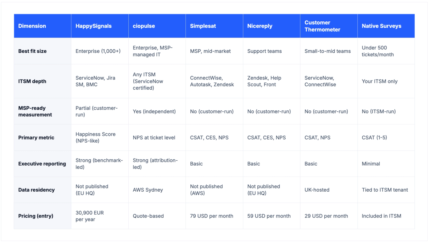
How to read this table. The four rows worth weighting most heavily for an IT decision are ITSM depth, MSP-ready independent measurement, primary metric, and data residency. Pricing is important but almost always negotiable at the enterprise tier. Executive reporting matters if you're presenting to a board, and can be built in Power BI or Tableau if your chosen tool doesn't ship with it.
The data-residency row is where the honest picture gets uncomfortable for buyers in regulated industries. Every tool in this comparison publishes compliance frameworks (GDPR, ISO 27001, SOC 2). Most do not publish the specific AWS or hosting region where employee data physically sits. For ANZ buyers, the shortlist gets short fast: ciopulse is the only tool in this comparison hosting locally in Sydney. For UK buyers, Customer Thermometer's UK residency is a real answer. For every other tool, ask for the specific region in writing before you sign.
How ciopulse Fits Into This Picture
If your shortlist has landed on the "ANZ / regulated industry / MSP-managed / NPS-first" profile, ciopulse is the tool built for it. A short, honest summary of what it actually does, without the marketing gloss.
When a ticket is resolved in your ITSM platform, whether ServiceNow, Jira Service Management, Zendesk, or any other, your ITSM sends the user a short ciopulse survey link as part of its normal closure notification. ciopulse hosts the survey page, captures the response, and matches it back to the ticket, the agent, and the team it came from. The survey takes under two minutes and requires no login.
A few things worth knowing. The primary metric is NPS, applied transactionally at the ticket level. A monthly customer satisfaction report, built on NPS, gives IT leaders a familiar summary view of the numbers. Detractor ratings (0 to 6) surface in a daily Service Recovery digest to the support lead by SMS and email, so poor ratings get a follow-up conversation while the ticket memory is still fresh. PulseAI, ciopulse's opt-in AI feature, summarises open-text feedback at the aggregate level (monthly per client) to surface recurring themes without a person reading every comment.
ciopulse works with any ITSM platform that can include a URL in its closure notification, with a certified app on the ServiceNow Store for the simplest setup. It's a ServiceNow Select Partner and an AWS Partner, with all customer data resident in AWS ap-southeast-2 (Sydney).
Frequently Asked Questions
What's the difference between CSAT, NPS, and CES for IT support?
CSAT is a satisfaction rating, usually 1 to 5. NPS is a loyalty score on a 0 to 10 scale, where lukewarm 7s and 8s count for nothing and detractors are flagged by design. CES measures effort. For a service desk, NPS at the ticket level is the demanding signal most XLA programmes now prefer.
Do I need a specialist tool if my ITSM already has a survey?
Not always. If you're under 500 tickets a month, single-team, no MSP relationship, and satisfied with a simple rating, the native survey may be enough. Add a specialist tool if you need agent-level attribution, service-recovery automation, sentiment analysis, XLA reporting, or specific data residency.
Which of these tools is best for MSPs?
Simplesat is the strongest fit for small-to-mid MSPs, especially those running ConnectWise or Autotask. For enterprises managing an outsourced MSP relationship, ciopulse's independent measurement layer is what turns satisfaction data into contract-grade governance rather than another metric the provider grades themselves.
How important is data residency when choosing a satisfaction tool?
For ANZ banks, hospitals, universities, government agencies, and any regulated industry, it's often mandatory. Ask any vendor for the specific region in writing. If they publish only compliance frameworks (GDPR, ISO 27001, SOC 2) without naming the region, treat that ambiguity as a procurement risk.
Can I replace Delighted with any of these tools?
Yes. The closest replacement depends on how you used Delighted. If you ran NPS at scale for IT support, ciopulse and HappySignals both cover the ground. If you used it for lightweight customer feedback, Simplesat or Nicereply are the more like-for-like options. Whichever you choose, you'll need to import your historical Delighted data separately, since the platform terminated in June 2026.
See ciopulse in action
Real-time IT satisfaction feedback that integrates with any ITSM platform. Book a 15-minute demo and see how it works.
BOOK A DEMO